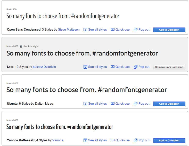
Google has a large set of web-optimized, open source fonts, and an easy to use interface to help select that magic one. The fonts load fast, even loading the webpage on a tethered 4g (not LTE) laptop almost as quickly as I can scroll down. When there are 600+ fonts, you’re going to do alot of scrolling.
I settled on the Lato font at 400 weight. On my Keynote presentations, I’ve used Helvetica Neue with light weighting since 2009. So I guess I was looking for something similar. I wanted thin lines, which Helvetica Neue does with good effect. However unlike presentations, I presume someone will be reading these paragraphs. So on a browser, perhaps something with a bit larger character spacing would work. Let me know what you think….

